The Measuring Engagement series starts here. For a clickable index of the 5 part Measuring Engagement series, look here.
Last time we addressed the topic of measuring Engagement – and attributing actual Value to it – we were looking at visitors generated by various campaigns. Here is what the Frequency (average number of visits) and Recency (average days since last visit) look like in a web analytics interface:

And here is what the Campaigns, numbered 1 – 16, look like in the Current Value / Potential Value Map:
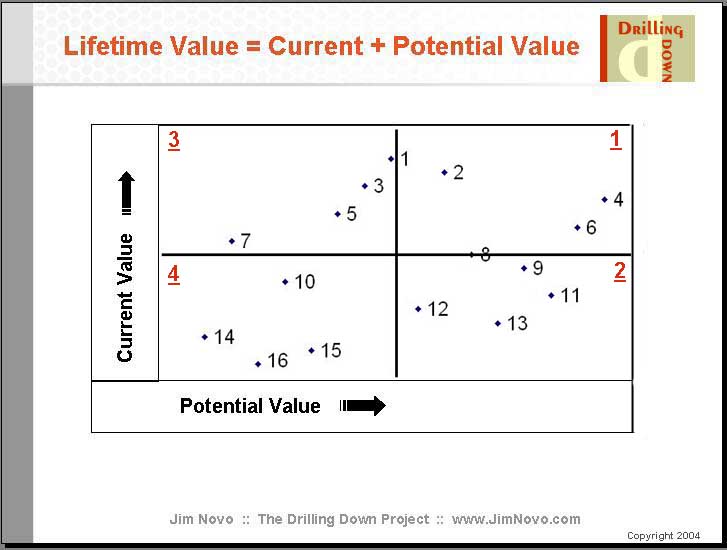
Quadrant 1 contains campaigns generating visitors with both high Current Value and high Potential Value – these are the campaigns deserving more investment because the visitors created generate highest value to the company now, and have the highest likelihood to generate more value in the future (are the most Engaged). If you’d like to know more about what metrics drive the Map and how it was created, see here.
Beyond Campaigns, how else can we use the Current Value / Potential Value Map?
Search Phrases
One of the more interesting uses is looking at search phrases as the “campaigns”. Search marketers, especially PPC folks, are often victims of initial conversion rate-itis, where campaigns are managed and funded based on a short-term conversion rate. To be fair, often this is a systems integration problem more than anything else – there simply is not enough “visibility” in the out weeks to determine if longer-term conversion to final goal is occurring. This is common where there is not a clean integration between web analytics and the back-end commerce system, for example.
Using the Customer Value Map with search phrases provides you with a way to imply a future conversion and balance out some of the decision making on short-term conversion. If you know a certain search phrase is generating visitors who visit Frequently and are still Recent in their visit behavior (Quadrant 1), you can imply this phrase is going to be more profitable than a phrase generating visitors who end up in Quadrant 4. For an example of this idea in action, see here.
Likewise, let’s say you’ve optimized the heck out of all PPC campaigns as far as copy, landing page navigation, etc. and still have a number of phrases that are “breaking even” on an ROI basis. But some of these break-even campaigns consistently deliver visitors who end up in Quadrant 1. The last campaigns I would kill are the ones delivering visitors who end up in Quadrant 1, since these visitors have the highest Potential Value. Kill Quadrant 4’s first, then 3’s, then 2’s to see if you can get where you need to go in the overall ROMI mix. Then do anything you can (including fishing through databases / logs manually, if need be) to find out if those Quadrant 1’s are really not paying out – I’d bet something is missing, there is a break in the logic / code somewhere that is not giving credit where credit is due.
Navigation / Functionality
Before we get into this area, let’s step back a minute for a global thought.
This Retention / Engagement analysis stuff may seem oddly strange to you, and if it does, this is probably the reason: what is most important to measure in this area is what does not happen.
Think about it. This is not what you are used to in web analytics (or most other transactional analysis) – you are always focusing on what did happen. How many visitors, clicks, conversions, etc. happened? But I ask you this: in terms of Objective / Action, where would you want to take action in the Engagement area, where would the highest payout be? Right. Not with the Visitors who are already Engaged, but with those who are becoming less Engaged – where something is not happening.
Keep that in mind as we go through the next section…
Has this ever happened to you? Your revenue KPI’s start sinking, gradually at first, and then at an increasing rate. You run around trying to figure out what the problem is – campaigns, changes in natural ranking, competitor activity, whatever. You’re pulling your hair out because it doesn’t make any sense – everything is tracking “normal”, right? No changes in the past few days, or even weeks? Right. So, what the heck is going on?
Understanding the Volume of traffic by segment to your site is a given. But what happens to visitor Value segments after their first visit cycle is important as well. I can’t tell you how many times I have seen people screw themselves over the longer run because they are tracking / optimizing for Current Value rather than both Current and Potential Value. This is a particularly important idea when you are testing new navigation / functionality and content or products, because it’s not only Campaigns that determine the long-term quality of visitors, but also the site itself.
Here’s an example. Let’s say you have a simple visitor value segmentation of visitors during the past 12 months that divides the Current Value of Visitors into 2 groups – Frequency over 50 Visits and under 50 Visits. Further, you divide Potential Value (Engagement) into 2 groups – Recency of Visit within 2 months and over 2 Months ago. You end up with a 2 x 2 Visitor Value Map that looks something like this, with percentage of the 12 month visitor base listed in each Quadrant:
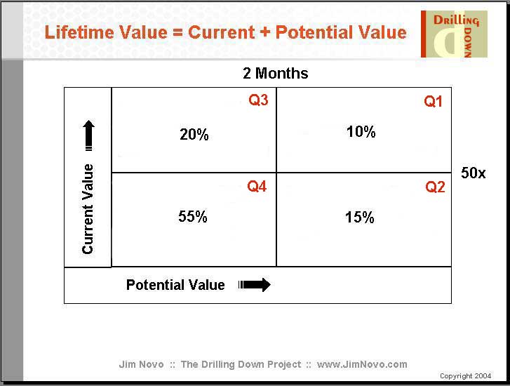
(Analysts: This simple data set, the first time you present it, may cause some rapid heart beats, Trust me, most every site looks about like this – the majority of Visitors are in Quadrant 4 – have only visited a few times and have not been back lately. What’s a few rapid heartbeats among friends anyway?? Gulp… Hey, you’re an analyst, you’re used to this kind of thing!)
In the chart above, we see 10% of your Visitors are in Q1 (Quadrant 1) – at least 50 visits, Last Visit within 2 Months. These are the 10% of your Visitors who probably drive the majority of your revenue, the “rocket fuel” visitors. Q3 is where former best Visitors end up – they have high Frequency / Current Value but have abandoned visiting the site. If you’re not clear how time since Last Visit date correlates to site abandonment, see here.
Now, let’s say you make a major change in navigation on the site. Traffic flow to the site remains the same; all the same campaigns are running and everything seems normal. Hopefully, conversion even goes up (that’s why you redesigned the nav, right?)
A couple of months later, all of a sudden your revenue per visitor or visit metrics start to slip.
Thankfully, you have been keeping track of the Percentage of Visitors in each Quadrant of your Customer Value Map over time (phew!) – I wonder what that looks like? Here is what you find:
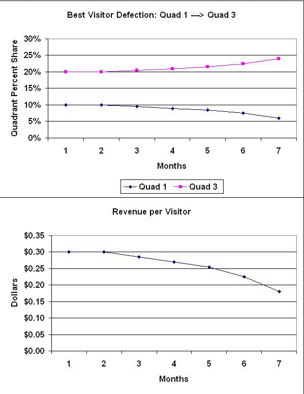
The Quadrant 1 Visitor segment (Top Graph, dark line) is shrinking; it has dropped from 10% of the visitor base to 6% or so over a 7 month period. Doesn’t sound like much, right? That is, until you remember that these Quad 1 rocket fuel visitors are responsible for a very significant portion of your revenue. This means, of course, that your revenue per visitor follows the shrinking Quad 1 population right down the curve, as shown in the Bottom graph above.
Think about it. In terms of gross numbers on the site, you would hardly notice a change like this in any of the “did happen” metrics. Traffic and conversion, traffic and conversion, all just chugging along, right? But this change in a small yet powerful group of Visitors significantly affects your Revenue KPI’s – because something did not happen.
Where are these Quad 1 visitors going? Well, they are becoming dormant – they are moving into Quad 3 – high Frequency but poor Recency (Engagement). It’s really the only place they can go; most can’t move to Q2 or Q4 because they have high Current Value as they start to move. So as the population of Q1 shrinks, the population of Q3 rises, as seen in the Top chart.
What you are seeing in the chart above is a tangible visual representation of Best Visitor defection – visits not happening among most Valuable Visitors – that is hard to dispute. Can you say Engagement Dashboard?
Then why is this happening? I’d bet on the navigation change. The problem is, of course, that unless you have a chart like the one above, it will be difficult to prove this idea to anybody, since the drop in the revenue KPI’s lagged the navigation change by such a long time, and all else remains consistent.
The fact is, you changed your “product” – the web site. For some reason, the site simply does not generate or retain high value Quad 1 visitors like it used to. Perhaps you pissed off the current Quad 1 Visitors with your changes. Maybe the parts of the site that create new Quad 1 visitors are now buried in the new navigation, so up-and-coming Best Visitors (Quadrant 2) never find these high value creation areas.
Did you bury sections of the site considered “low volume” in the navigation? Better check that idea, because the low volume areas (uniquely targeted areas?) often create the highest value visitors. You can check on this by running a Current Value / Potential Value Visitor Map for each Content Group – hopefully, before you make any changes to the web site!
Next time we visit this topic, we will look at Customers – those good folks who actually pay money to support a web operation. If your web analytics tool does not support Visitor Frequency and Recency, you can still use the same Current Value / Potential Value model to manage Engagement through your customer database.
As always, your comments and questions appreciated…
The next post in this series on Measuring Engagement is here.
This post makes my head hurt. In a good way…
I’ll be rereading it later to let my brain catch up to my eyes more…
Thanks, Jim.
Ryan, sorry I made your head hurt!
If you accept that visitor segments can have different values to a site, e.g. visitors from AOL versus visitors from Google, then Recency just provides you a way to prove that faster because it is predictive. You don’t have to wait nearly as long to start guessing who the winners and losers are, which means you can react more quickly.
This same idea can be applied to any segments where an action is involved – visit, purchase, download, whatever. The segment with the shorter average Recency is the one most likely to keep coming back.
The last part of the post is really about the leverage inherent in Pareto distributions, which tend to be more exaggerated to 90 / 10 or so on the web. If 10% of your vistors create 90% of the value, you don’t have to lose many of them to get an impact, and this kind of loss is easy to miss if you are just looking at the volume of visitors coming to the site.