The Measuring Engagement series starts here. For a clickable index of the 5 part Measuring Engagement series, look here.
The good thing about doing customer analysis as opposed to visitor analysis is that you don’t need a fancy-dancy web analytics set-up to do it. Most folks will be able to take advantage of the following ideas using some simple queries on the customer database or an export to a spreadsheet.
Last time we addressed the topic of measuring Engagement – and attributing actual Value to it – we were looking at how to predict the effect of Content changes on Revenues using the Current Value / Potential Value visitor segmentation model. This time, we tackle the same kind of modeling at the commerce customer (online or offline) level.
Recall that with visitors, we looked at a segmentation using under or over 50 visits for Current Value and Last Visit within 2 months or over 2 months to define Potential Value (Engagement). With e-commerce customers, the value of a single action (purchase) is generally much greater than the value of the average visit, so it’s worth it to create a finer segmentation because the data is more actionable – and the profit potential much greater.
Here we have the entire customer base of an online retailer in the 4 square Current Value / Potential Value grid we have used previously for Campaigns and Visitors – click on the image to enlarge:
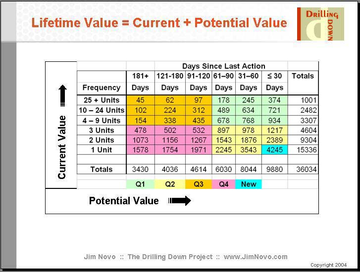
As you can see, the vertical Current Value axis is Frequency of Purchase, with finer divisions for lower Purchase Frequency. This is because as you move up towards greater Frequency, customer behavior becomes more similar, and you don’t want to have “infinite” segments. On the lower end, the response behavior is different enough between say, a 2x buyer and a 3x buyer, that the segmentation is useful because the different segments respond differently to the same promotion. The horizontal Potential Value / Engagement axis is made up of Days since Last Purchase (Recency) blocks of 30 days each out to 120 day Recency where, as with Frequency, the behavior starts to become similar so it’s not worth looking at finer detail.
Of course, you can break the customer base into as many segments as you want on either axis, you just want them to be large enough to be worth taking action on. Smaller customer base, probably fewer segments is better. Larger customer base, more segments. And you can certainly define your actions and divide your Quadrants in any way that makes sense to you – usually based on some kind of testing. Consider this CV / PV customer map a “default” place to start.
The four colors represent the same Four Quadrants we have been working with throughout this series:
Q1 (Green) is the Rocket fuel customer set – highest Current Value and highest Potential Value – they are best customers (Current Value) who are also the most engaged (Potential Value). Q2 (Yellow) are newer customers with Low Current Value but are still Engaged and so have high Potential Value; the Blue square within the Yellow region contains brand new customers – a very Recent first purchase. Q3 (Orange) contains former, dis-Engaged Best customers. Q4 (Violet) contains the dreck of the customer base – 1x or light buyers that never bought again. These folks are often created by inappropriate or mis-targeted acquisition campaigns.
Why would you want to do this segmentation? Well, asked another way, does it make any sense to you that the optimal communication and offer stream would be the same for each of these 4 segments? Think about it.
Q1 folks love your company and are eager buyers, with high likelihood to purchase again. Do you want to use a heavy discount approach with these folks, giving up margin you would likely capture anyway? Instead, how about trying to enagage them across multiple product lines or inviting them to participate in feedback panels or other high engagement activities? At least you know who you are talking to – as opposed to “random surveys” where you have absolutely no idea who you are getting feedback from.
The Q2 area (Yellow) contains up-and-coming best customers, brand new customers, and customer dreck headed for Q4. You can tell which is which by just looking at the chart – up and comers are top right of Q2, new customers bottom right of Q2, pre-dreck on the left side of Q2 on the border of Q4. Do you want to send all these groups the same communication stream and offers? Really? Is that approach “optimized”, from a marketing perspective?
The Q3 (Orange) folks are former best customers. ‘Nuff said there. This group requires special communications handling and depending on their Current Value, are worthy of further research. This is where a lot of your service problems, over-promising on Brand, and unfulfilled customer expectations lie. Again, since you know exactly who they are, a survey here might be helpful, don’t you think?
The Q4 (Violet) area needs to be turned inside out and viewed by campaign source, product purchased, and so forth. Why are you creating dreck customers? Are your offers too strong? Your featured products creating negative experiences? Your list sources not really what they claim to be?
I don’t really want to use the word Persona here to describe the differences between customers and the appropriate messages in these four Quadrants, but the idea is similar. If you can empathize with the customer based on their demonstrated behavior, you are simply going to be a more effective marketer. This is the edge of the “right message, to the right customer, at the right time” tactical approach.
Further, your response rate for a particular promotion to any one “cell” on this customer map is going to remain fairly consistent over time. Why? Because the population in that cell is replaced by customers with the same behavioral profile each month.
Here’s how it works. If you think about it, there is a non-stop process of customer migration across the map from right to left through the columns each month. If a customer makes a purchase, they immediately move back to the right-most column and may move up a row. Then, customers start to move across to the left again each month. This pattern is highly visual and represents the LifeCycle of the customer.
Your job as a marketer is to make sure customers don’t march too far to the left, losing Potential Value as they move. You try to re-engage them with each promotion and if they respond, the customer jumps back to the right and possibly up a row – increasing both their Current and Potential Value. The most profitable campaign for each customer is defined by which cell the customer resides in at the time the campaign is dropped. So you can still do a “monthly” newsletter, for example, but to maximize profits, the content / offers for each customer would be defined by what cell the customer is in at the drop point.
While this might sound complex, the good news is that the customers in any cell as a group generally respond at the same level for the same offer every time. So once you figure out what the optimal campaign is for a cell, it doesn’t really change much over time, unless you further sub-segment (example below). As customers move through the cells, they are generally exposed to a lot of different campaigns (whatever is highest ROI for the cell) which maximizes the chance of response and reduces promotional burn-out.
For those of you with a programming eye on this, I think you can see how this campaign process could be easily automated because the cells are well defined numerically – if customer has 3 purchases and no purchase in past 2 months, send “Campaign X”, if customer has 3 purchases and no purchase in past 3 months send Campaign “Y”, etc. This creates a automated stream of “right message, to the right customer, at the right time” communications that are tailored to the actual behavior of the customer.
So how do you act on this info? Let’s say I have a group of customers who have just passed into Q3 from Q1 – these are best customers who are dis-Engaging. I know exactly who and how many there are – they are under the column “91 – 120 days” in the Orange Q3 Quadrant. There are 844 of them (97 + 312 + 435). What am I going to say to them, based on what I know of their value and current behavior? How much am I willing to invest to keep them Engaged? That’s the “drive more sales” angle.
The “drive more profits” angle would be to create control groups and test your messaging to this segment as well as the one preceding it (10+ units, 60 – 91 Days) and the one after it (10+ Units, 121-150 Days) and find out where the highest ROI is. This type of bevahioral targeting is the fundamental driving force behind the Discount Ladder profit optimization technique.
But that’s just the beginning of using this kind of segmentation. Consider these ideas:
1. When you kick off a large scale acquisition campaign, you are going to see the Blue square in Q2 “bulge” with all the new customers. Then, if you run this chart every month, you will see this bulge “pass through” the chart like a rat through a snake. Will the bulge head up towards Q1, meaning the campaign is creating Best customers? Will the bulge move to the left towards Q4, meaning you created a lot of dreck customers? Will the bulge “fork” and parts of it head to different Quadrants, depending on product of purchase or offer taken?
As a marketer or analyst, is it valuable to be able to predict the long-term results of a campaign before it is over?
2. You say, “Jim, that’s very cool and all, but the powers that be want all our segmentation by product affinity, you know, we customize communications and offers by the previous products purchased. So we can’t really use this.”
Hmmm. Let’s put aside whether this product-based segmentation decision makes any sense at all for the time being (the only sale you are willing to accept from the customer is for a specific product or category?), and take a look at how mapping the customer base using Current and Potential Value can help you put some facts behind these kinds of segmentation questions.
Let’s say for simplicity you have two product lines, hardware and software. Further, let’s say your customer base is the one in the CV / PV model above, which I will show again below for clarity:
All Customers
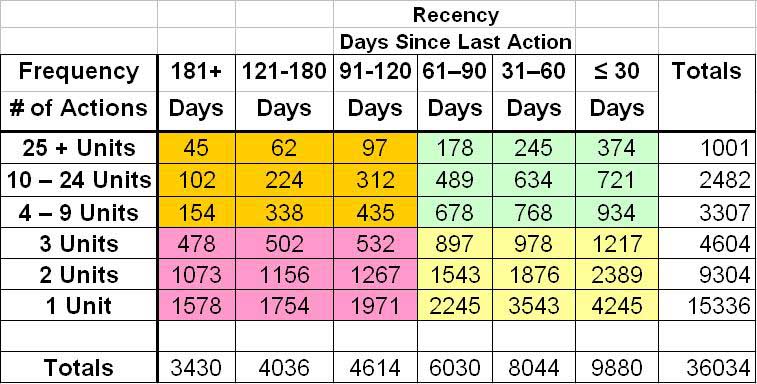
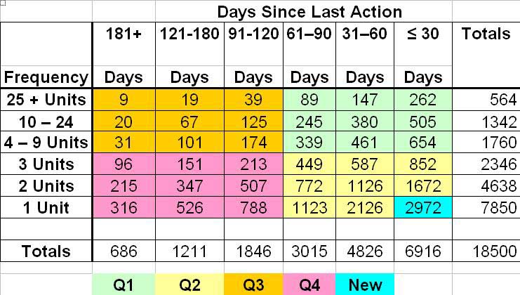
OK, so let’s say you take this customer base, and run your product affinity segmentation. Then you map each product segment by customer using the Current Value / Potential Value model, and this is what you get:
Software Segment
Hardware Segment
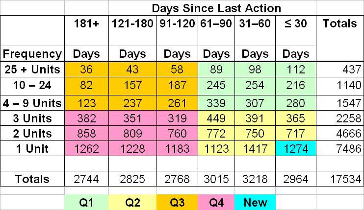
Note the label on the first map is “Software” and on the second in “Hardware”. What do these customer maps tell you?
Well, you have about the same number of customers in each segment – 18,500 in Software and 17,534 in Hardware. But you knew this. Take a look at the totals along the bottom of the grid, representing the total number of customers in each Recency / Engagement column. What do you see?
The Software segment has much higher Potential Value / Engagement than the Hardware segment.
If you look at the 61 – 90 day column, you see both the Software and Hardware segment have an equal number of customers. But the Software segment is clearly much more Engaged than the Hardware segment, as evidenced by higher totals in the columns to the right of the 61-90 day column for Software than Hardware. Conversely, in the columns to the left of the 61 – 90 day column, the totals for Hardware are higher than Software – these customers are less Engaged.
In other words, even though the gross customer numbers in these segments are close, the composition of the segments is quite different. Software has a higher number of very engaged Best customers and potential up-and-comers (Q1 and Q2), where Hardware has a higher number of dis-Engaged Best customers and dreck customers (Q3 and Q4). Further, you can say with certainty that relative to the Hardware segment, the average customer in the Software segment is going to create more value for the company in the Future.
This ought to tell you something about the way you optimize marketing to each segment, and the way you should market within each segment, not to mention something about the products and / or service satisfaction in each segment.
Just by looking at these maps, I can tell you several things:
1. The response rate for Software campaigns will be consistently higher, over and over, than the response rate to Hardware campaigns – pretty much regardless of what kind of offer you make, as long as the offers are similar.
2. For the same dollar spent, the Software segment is driving your business, the Hardware segment is dragging it down. You can either roll with that situation and reinforce it in your communications, or you can try to fix Hardware. For example, when you choose to feature an item, all else equal, I’d feature Software, because it has the longest customer legs and drives higher repeat purchase.
3. For the same dollar spent, I would focus more heavily on Software in new customer acquisition Campaigns because this segment generates better, higher value customers for the business.
Now, at this point, I hope something has occurred to you. That’s right, you could do this same mapping using any customer segmentation scheme you think is meaningful and compare the value of the customer maps. Compare the results of Campaigns using these customer maps. Compare organic search versus paid search. Compare Geography, if you think that is meaningful. Compare average price points, order sizes, shipping choices, coupon usage, e-mail opens, whatever customer variable you want – and find out which variables drive the highest customer value.
Further, you can use this model across any kind of “action” you want to map – purchases, visits, downloads, blog posts, phone calls, whatever you want. You can use it to compare customer value across channels, and start building the knowledge you will need to optimize the business in an omni-channel world.
My final point is somewhat abstract but I want you to consider this: What is the value to the business of having a customer value model you can use to:
1. Objectively measure the value of content or products to a customer segment without inside-company bias
2. Predict the value of a customer segment to the company in the Future
3. Drive the allocation of content, design, or marketing spend towards highest ROI
4. Provide consistent, repeatable campaign targeting results, so you can actually predict response and ROI
5. Analyze any customer “action” variable, in any channel, across any segmentation scheme
6. Present customer valuation concepts to Execs and fresh-faced MBA’s alike in a simple to understand format
The same basic model, over and over, to make highly actionable customer decisions with.
Do you think using this model might streamline the marketing decision making process, result in more accurate decisions being made, reduce campaign turn-around time, and result in higher profitability for your company?
As always, comments and questions on the above are appreciated.
The last post in the Measuring Engagement series is here.
Thanks for calling out Multichannel Forensics. Jim, that was very nice of you!
Your articles are well written — worthy of an e-book on the subject.
Thanks Kevin, and you’re welcome!
Surprise, I have both an e-book and a hard cover book that describe in quite a bit more detail how to use all of the simple behavioral models for maximizing marketing ROI, for both B2C and B2B . See:
http://jimnovo.booklocker.com/book.html
Sample of the book (Chapters 1 – 9) here:
http://www.booklocker.com/pdf/224s.pdf