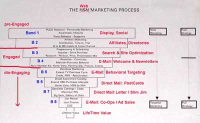
Now that we’ve had some discussion on the ideas behind these charts, let’s dig deeper into the Marketing Bands chart and review details at each level (click for a larger image in a new window):
What we have here is a chart of the optimized interactive Marketing Bands system we developed at HSN, with an overlay of comparable online Tactics in red (Band numbers in Blue).
After nearly a decade of testing, we arrived at the place where each dollar of marketing spend – at each level – yielded the highest profitability to the company. Many of the examples here pertain directly to web marketing, and I promise I’ll be specific on that.
