Jim answers questions from fellow Drillers
(More questions with answers here, Work Overview here, Index of concepts here)
Q: I was wondering if you’ve done any work with, or given thought to, companies who have a cloud based Freemium business model?
Should they be tracking usage (or anything) at the free level? Should they be tracking usage at the paid level? I’m sure defection rates are a big problem, but I’m wondering how many focus on engagement thru mass marketing versus trying to keep what they’ve got, or influence the free users to make the leap to paid. Any thoughts on this? Maybe you could do a blog post on it. It seems like a good fit with your brand of analysis but I’m just starting to think it through…
A: I just finished an analysis that’s a good example of this problem. Behavior during the Freemium period can predict who is highly likely to become a paying customer, who will need marketing efforts like additional sampling / package discounts, and who will not become a customer no matter what you do.
So the answer is you need both, analysis of paid and free. But in particular, what you need to do is understand the transition from free to paid by comparing the behavior of known converters versus non-converters over time, preferably using events that create value for customers.
Typically the differences will be volume / persistence related, generically, low Recency high Frequency. Also, likely converters to paid will tend to use a wider variety of features consistently. In the analysis, the question to answer is which of these value-creating behaviors is predictive of becoming paid?
Said another way, you tend to see a fairly fast drop-off among *all* new Freemium customers after the initial burst of activity, but the ones that are not going to stick tend to drop off even faster in their activity. Then, there is a “bounce” in activity where the ones who are most likely to end up as paid begin to cycle behavior more quickly and begin to use more features, and the others simply drift off the map, with no “bounce” as Recency becomes extended.
Classic LifeCycle analysis – customers tell you what they will become in the future by what they do today. Having the very detailed behavioral information typically seen with interactivity just multiplies the ability to do this kind of prediction. More on the Freemium model, including determining appropriate cost to acquire, is here.
Q: Do the standard analytics packages allow a business to look back at the “free” behavior of paid subscribers? I’m thinking of Freemium cloud based solutions and how they would track this. Do products like Crazy Egg get you there or do you really need something more sophisticated to do this kind of analysis?
A: I’ve never used Crazy Egg so I don’t know about that one specifically, but in general you can do quite a lot with the basic tools that support customizable segmentation. The challenge with going that way is you have to be super-technical with the implementation to capture important event data points, you have to create many different segments, and then the killer problem – you can’t “re-analyze” a different approach with these tools, for the most part. If that’s what you mean by “look back”, it’s highly unlikely you could accomplish what you need to do.
So it’s possible, but these tools are not really designed for “behavior over time” work and certainly don’t allow for much “exploration” of the data – any change in analytical approach is likely to be a “going forward” type of measurement, not looking back. So there would be lots of iteration before you even knew if the analytics set-up was correct or what events are meaningful. In other words, it’s possible but could waste a LOT of time.
I’d much rather find the system that contains the key elements of activity – when did they sign up, what features are they signed up for, when did they add other features. This data probably resides in whatever system manages the account. Dump that data off into a spreadsheet or database, try to figure out what’s meaningful, look for correlations.
Then, once you have a grip on some solid ideas, then maybe you go into the front end and try to align traffic and behavior with known “events” that seem to predict upgrade to pay, if that’s what the mission is.
Otherwise, you will be setting up a ton of tracking on all kinds of events not knowing what is meaningful, and then dealing with a really poor interface for the analysis of those events.
The other way to go, of course, is to use one of the advanced web analytics tools, which sit on real databases and can be queried. But assuming that’s not an option, I would try to look for hard data points in the backend first, then knowing key behaviors, look for what might cause those behaviors in the traffic side.
Example
Let’s say you have a project management application that has a 60-day free trial then converts to paid. Value is created for the customer when they use the functionality of the app – say create project, comment on project, upload file, or any other actions you deem critical. “Traffic” in a situation like this may be only marginally indicative of value creation; rising activity could even be a negative indicator (frustration with application).
So, you want to create a situation where you can analyze these important behavioral events by account, and (ideally) you want to know the source of the account creation – campaign code, referrer, etc. That’s all you need for data, simple table, maybe a dozen columns.
Then, compare average account that converts to paid with average account opened at the same time as the converters but does not convert, over the 60-days before trial end. For each of converting and non-converting, aggregate each of key events by week, divide by number of accounts to get average behavior per account, and you would have 8 weekly average data points for each of the events, both for non-converting and the converting accounts. Maybe a dozen simple line graphs with 8 weekly data points, one set for accounts that paid, one set for accounts that did not.
Converting and non-converting graphs should look different for some variables. Both will typically start out with high levels of activity, then for some variables you will see them diverge. This not only predicts which variables affect conversion, but reveals to you the best time during the 60-days to intervene with surveys, help, or other marketing programs to re-engage the accounts that appear to be headed for defection. If you have campaign data, also which campaigns tend to create accounts that convert and which don’t.
One of the event graphs may look to be more predictive than the others, with abrupt changes in direction going into the conversion event. For example, perhaps it will look like this:

(Click pic for larger image)
This is the behavior of 10 different 1st year spend levels (deciles) over the first 14 weeks of their Life, engaging in an event that creates value for them. The dark blue line represents average top spender. Note how for top spenders, the profile is quite different. The graph tells you that by week 4 or so, you can probably predict who will become a best customer and who will need intervention based on this activity.
You can run this kind of event profile for any variable – events, campaigns, etc. as long as you know complete / non-complete goal or end value of the customer. In your case, since the goal outcome is binary, there would be 2 lines instead of the 10 spending deciles above: converters versus non-converters. Create a converter versus non-converter chart for each key activity variable (create project, comment on project, upload file, or any other actions you deem critical), and look for this kind of divergence.
Drilling down more deeply by excluding all but 3 lines so we can see the behavior “in the middle”, we find some interesting patterns:
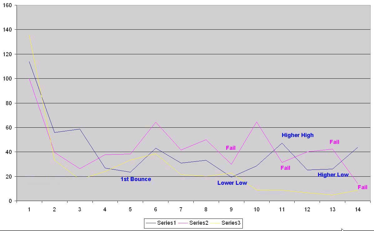
(Click pic for larger image)
Here, we see patterns that provide clues to the testing targets one might want to address to see if “middle” customers could be turned into better customers. The blue segment, showing a series of higher highs and higher lows after it “bottoms” for this behavior, is most likely to benefit from intervention of some kind. The pink segment looked promising, but then put in lower highs and lower lows – these customers lose momentum quickly and have trouble self-sustaining. The yellow segment was never really in the game at all.
Yes, the comparison to stock market charting is intentional! It’s an expression of group behavior.
If I had to pick the segment with the best potential, I would try the blue segment first, and the data points could be used for automated triggering of different types of campaigns. For example, “If by week 4 activity for Variable X falls below 60, trigger Campaign A. Then if by week 11 activity for Variable X is not above 40, trigger Campaign B.” Remember, these are averages, so not all customers in the segment are below threshold. The idea is to target a specific behavior with a specific message.
Just to be clear, you don’t need the goal value of the customer to put a model into practice, only to prove the initial model – certain patterns in behavior predict high value customers. Once you know the end value of customers – convert or not, monetary value, any goal – you can run the LifeCycle movie “backwards” like the charts above and find out which early behaviors are predictive of high and low value customers.
If you want to go further, you could show these graphs and data to a modeler and see if they can create a more precise mathematical model, which can be developed much more quickly with this kind of evidence to review.
Once you fully understand what this LifeCycle landscape looks like, THEN you could go back and instrument the web site and analytical tool to monitor some version of this data in a more automated way. But trying to guess what’s going to be important beforehand and work through a study like this using a vanilla web analytics tool is the very, very long way to get where you need to go!
Jim