Over the years I’ve argued that there is a single, easy to track metric for buyer engagement – Recency. Though you can develop really complex models for purchase likelihood, just knowing “weeks since last purchase” gets you a long way to understanding how to optimize Marketing and Service programs for profit.
Which brings me to the latest Marketing Science article I have reviewed for the Web Analytics Association, Dynamic Customer Management and the Value of One-to-One Marketing, where the researchers find “customized promotions yield large increases in revenue and profits relative to uniform promotion policies”. And what variable is most effective when customizing promotions?
The researchers took 56 weeks of purchase behavior from an online store, and used the first 50 weeks to construct a predictive model of purchase behavior. Inputs to the model included Price, presence of Banner Ads, 3 types of promotions, order sizes, number of orders, merchandise category, demographics, and weeks since last purchase (Recency).
The last 6 weeks of data were used to test the predictive power of the model, and the answer to which variable is most predictive of purchase is displayed in the chart below, click to enlarge:
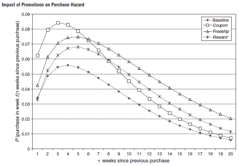
Weeks since last purchase dominated the predictive power of the model, controlling not only the Natural purchase rate (labeled Baseline in chart above, people who received no promotions) but the response to all three different types of promotion.
The Natural buying rate (or control group; here, as much as 50% of campaign response) has tremendous implications for the measurement of Campaign profitability, and can also be used to measure the success of customer-centricity / experience / social programs. These are the issues I cover in my review of the article. If you’re interested in that take, you can read it here.
But for this post, what I’d like to do is explore the Recency measurement idea itself, because I suspect a lot of people may not understand what it really means. And since many Marketing folks are not used to taking action on this kind of data, also talk about what you can do with this information.
Most people think of time in a linear way. A graph that includes time typically starts at some point in the past and churns through time in a sequential fashion. Not so with the graph above, which is looking at Purchase Cycles.
In this style of cycle measurement, customers are moved back to the time = zero segment (left side of chart) as soon as a purchase is made, and time starts all over again for these customers. If they don’t make a purchase, they continue to slide out down the curves to the right. Can you picture this activity in your mind?
You can have customers who stay at the top end of the graph, rapidly cycling round back to zero weeks each time they purchase. You can have customers with longer cycles that loop back to zero weeks in slower purchase cycles from the middle. You can have customers who purchase only once and every week just slide out further way from zero until they fall off at the right.
That means the same person might be in different places on a curve in different weeks. The same person can buy 2 weeks after last purchase or 4 weeks after last purchase, or a person can buy every week, or every month. All of these purchase cycles summarized produce the series of likelihoods you see on the chart.
The point of the chart is, no matter which promotion customers are exposed to, no matter when their previous purchase was made (2 weeks ago or 20 weeks ago), their likelihood to purchase again can be very simply and accurately predicted by knowing one simple data point: weeks since last purchase.
Said another way, because this is a core concept to customization using behavior:
Customers with all kinds of different purchase patterns, demographics, categories of purchase, campaign exposure, and so forth tend to behave in the same way, that is, their likelihood to purchase at any given point in time from this online store is primarily a function of how long it’s been since they last purchased from the store.
There are some pretty significant online marketing implications from a statement like that. But how do you act on this information?
You’ve probably heard of the “sales pipeline” idea from B2B. Sales management gathers data to inform them on which deals are likely to close and when, and build a flow chart of expected revenues. This helps management take action on any deals that seem to be “floundering” – special exec attention, discounts, bundling, etc.
You can do this in B2B because the value of the customers is usually quite high, and you have sales people or account managers who are close to the customer and can provide this data.
In B2C, you can’t afford to have account people for each customer, but using Recency you can predict which groups of customers are most likely to purchase again, and then build the same kind of sales pipeline. And then, customize your Marketing action based on whether the customer seems likely to buy or is “floundering” and drive increased profitability.
Building a sales pipeline model can also be used to predict how well the business will be doing in the future, and what kinds of products or tactics are really driving future profits. Like other kinds of optimization, moving focus or resources towards products and tactics that are driving value, and away from those destroying it, results in a more profitable business. But using Recency, instead of optimizing the Present, you are really optimizing the Future.
Look at the chart above. There is a discount promotion and a free shipping promotion. The coupon promotion outperforms the free shipping promotion as long as the customer has purchased in the past 6 weeks. After this point, free shipping outperforms coupons. That is something, as a Marketer, I think I’d like to know. It means to optimize this system, I should deliver campaigns not based on my calendar, but based on the customer’s calendar as evidenced by their purchase cycle behavior.
Similarly, around week 8 since last purchase, coupon performance drops below the baseline performance of people in the loyalty program. And finally, at 20 weeks, coupon performance is basically equal to the Natural buying rate, meaning virtually everyone using a coupon would have purchased anyway without the coupon.
Please understand, I’m not saying these Recency curves will be the same for your commerce site – they will depend on the type of products you sell, how good your service is, and so forth. You have to do your own analysis. What I am saying is the Recency effect is universal and can be the most important variable you could ever use for segmentation if you are concerned about campaign profitability.
For a practical perspective however, data in the format above is difficult to use and explain to other folks. I much prefer what I call the LifeCycle Grid format below, click to enlarge:
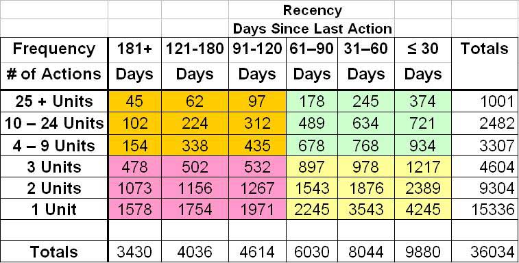
People are more used to seeing data in a format where “up and to the right = better” so I have flipped the zero Recency boundary to the right side. The customers with the lowest future value are in the lower left (Pink) and highest future value are in the upper right (Green). I have also cross-tabbed Recency with Frequency so we have an idea of the value of a customer; the value of the customer helps decide how to approach the customer. For Recency, we have chosen “hard breaks” rather than a smooth curve. This creates specific populations so we can target certain groups and measure results.
Example: If I send a 10% off promotion to all customers, you will see dramatic differences in response and profitability across these different cells. Working the grid this way with various offers, you will find that allocating the same Marketing budget and promotions evenly across all the cells is truly a suboptimal approach.
Additionally, the general location of the cell gives clues to customizing campaign content or angle of attack as well as customizing the offers. In general, for the four colored segments:
Green: Best customers who are Engaged – this is a segment where aspirational messages and services are extremely effective. Think “Special VIP treatment” in campaign copy and offers.
Orange: Best customers with declining likelihood to purchase again – if you are truly customer-centric, it’s time to analyze (or survey) these customers for broken products, processes, and service. Why is a best customer dis-engaging? Can we help you? Did we do something wrong? Would you recommend us?
Yellow: Potential Best Customers – new customers and those who are “floundering”. What can you do to turn them on? This is a group that benefits from category or affinity analysis to inform campaign content; help them try new product ideas.
Pink: Defected Low Value Customers – high value, broad discounting (30% off anything) is probably the only thing that’s going to drive response from this group – is it really worth it / do you actually generate profits here?
From a management perspective, feeding specific populations through the Grids can inform strategic decisions. If you believe the Grids essentially represent a sales pipeline, then how do the pipelines for different customer segmentations compare?
An obvious place to start is Campaigns – what do the sales pipelines look like for different Campaigns, which Campaigns generate the highest percentage Green segment 1 month after Campaign drop? What about at the end of month 3?
Run Product or Category analysis through the Grids. For example, new customers whose first purchase is in a certain category – does this category create customers with high pipeline value? What about customers who continue to buy in the category? Softgoods versus hard goods? Software versus hardware? Shouldn’t we feature products that drive high pipeline value in campaigns and on the home page, as opposed to products that generate 1x buyers?
How about channel analysis, which sources generate new customers with the highest likelihood to continue purchasing? Are most of our PPC customers in the Green segment, and most of our Affiliate customers in the Pink segment? Where do the Social customers end up? At 1 month after first purchase? At the end of month 3?
The beauty of this approach is it can be used over and over, on any platform, in just about any situation, to answer the same question: which activities generate customers with the highest future value? The Grids provides a consistent way to compare investments in all types of activities – products, campaigns, service initiatives, usability, centricity. Just take the population exposed to the test, run them through the Grid, and compare to average (or better yet, control).
Most Marketers grew up with a linear view of execution – just keep Pushing, the more impressions the better. Taking this approach in an Interactive environment completely ignores the fact that many customers will come back and Purchase again without any Push at all – and especially so if you are nailing all the centricity angles.
The trick is to optimizing Interactive commerce for Profit is:
1. Understand which tactics create customers with high pipeline value – those likely to re-purchase on their own – then,
2. Take Marketing action based not on a linear calendar, but a cyclical one – the calendar defined by the customer’s own behavior, customizing the message by location of the customer in the purchase likelihood Grid.
Execution Tips: List selection for this customization program is easily automated, right? Just use the Grid cell boundaries as selection variables. Many people decide to keep a regular generic “Brand” email communication to all customers while running the hyper-targeted communications based on cycle behavior underneath. In this case, consider backing off discounting in the Brand communication and stick to new products, new hires, content marketing, etc. and let the cycle-driven email handle the behavioral discount program. Test for the optimal balance / frequency between the 2 different emails by tagging e-mails with Grid cell.
Questions on this? Also, with this background you might now want to read my review of the study.
Jim-
What kind of predictive model was used in the study?
Was the free ship and coupon offered repeatedly to an individual (if someone purchased, they were then able to buy again with a reset recency correct – did they get a new offer)?
Thanks!
As is typical in academic work, they used tons of different models and then looked for the one with the strongest predictive power. Best to read the study itself for that info; the math is above my pay grade.
The offers were made in all kinds of combinations, including no offer, according to business rules set by the company (see the study). The main conclusion of the study is the promotions would be more profitable if they dumped all the business rules and simply used Recency.
I wondered if it was regular logistic regression of something more exotic.
Looks like you have to be a member to read the study – oh well
Here are some blurbs, perhaps they will be helpful:
“The model parameter estimates are fed into a dynamic programming
model that determines the optimal number, sequence, and timing of promotions to maximize retailer profits.”
“For our application, a discrete time formulation is more appropriate because it allows us to explicitly account for marketing activity in periods when households do not make a purchase.”
“We use a discrete-choice framework with time-varying coefficients to capture the duration dependence in the consumer’s purchase decision and promotion effectiveness.”
Then there is a whole section on trying 20 variations and looking for the best fit for predicting purchase *and* non-purchase. This bit about predicting non-purchase seems to be quite import to the researchers and I’m guessing this is where they are making some kind of academic stand versus prior art.
Does not sound like logistic regression to me – that I can understand!
Thanks Jim. Interesting. Does sound like there are a couple different things at play. Perhaps a discrete time survival model (given the reference to a hazard in the graph) and a discrete choice model.
Jim,
Thanks…. your research looks thorough and well done. This will aid me greatly in the next coming months in training some new staffers and taking some to the next level. Keep it up.
Hi Jim,
Many thanks for sharing this segmentation analysis, I have done a similar analysis following your method and the result is very surprising, my green cells is really a small portion!
Hi Brian,
May I know what model are you applying? Are you taking the 4 segments as a category variable and together with other variables to fit a logistic or survival model?
longing for having your feedback, thanks in advance!
Regards,
Echo
Echo – there’s nothing “wrong” with that, it just means something like “10% of my customers generate 90% of my activity”. Good to know, isn’t it? And how much more activity could you generate if you tailored marketing programs to the state of customer (which colored area they are in).
Also, there’s nothing “magical” about the boundaries used for the colored areas; I used 90 days because it’s a common breakpoint for activity (over 90 days with no activity, people become much less responsive). If you have a longer activity cycle business that boundary might move out in time (B2B) if you have a shorter activity cycle it probably should move to 60 days or even 30 days (social network).
Testing tells you where the boundary is most actionable; look for steep drop in response by Days since Last Action.
Hi Jim,
Agreed with you, I am also using 90 days. I thought my company customers are following the 20-80 rule, just a bit depressed to know it turned out to be 10-90 only, or maybe I should not say it 10-90, as most of them are new customers and existing customers kept drifting away from our site. My orange cells got big count, it seems there should be some action taken to retain those customers, maybe can send eDM, but the view and click rate is really low..
Regards,
Echo
The problem is the further people drift out and away the lower the likelihood they will return as customers (and lower response). The trick is to get to them with a compelling proposition *before* they drift too far away, which is earlier in the cycle than most people think.
Drop a promotion tagged by Recency across the population and you will see response that looks much like the curves in the first chart above. What you need to find is where profit is maximized along that curve, and then as each customer reaches that point, drop the specific offer that maximizes profit.
This is in fact a “series” of emails based on LifeCycle; those that respond pop back to the top of the curve and go through the cycle again.
In general, for commerce, this means a “ladder” of discounts where the discounts get higher as people fall down the curve / are less likely to respond. You pay for this margin hit by reducing discounts to people at the top of the curve who are highly likely to buy anyway.
See “Discount Ladder” for example of how to test this:
http://www.jimnovo.com/Recency-Discount.htm
This is one example of how to customize message by which cell of the grid people are in. You can also customize message using suggestions by cell color above. Doing both at the same time I find most effective.
The net effect of above is maintaining margin while driving higher response in the lower half of the curve.
Hi Jim,
It is very inspiring, our company provides free service to our visitors, but we may apply the LifeCycle to our clients, which is we have been thinking of for a long time but no idea how shall we start. Many thanks for the comments and articles, have a nice day!
Best,
Echo
Hi Jim,
Found the concept of recency very interesting. I also want to know if the “age” of an “opportunity” in a sales pipeline of a typical B2B company can also indicate the willingness to buy. Has there been any research in this area in the past? In other words, if my pipeline has 40% of open opportunities more than 400 days old, is this pipeline necessarily better or worse than another pipeline where say, most of the opportunities are less than 100 days old? In other words, does the quality of an opportunity deteriorate with its age?
You would realize that my question focuses on opportunities with customers, rather than customers themselves…
Regards,
Vivek
Hi Vivek,
Generally, the answer is yes, the viability of a prospect falls as time since first contact grows. But it depends a lot on product, the more complex the purchase decision, the longer a prospect can remain viable.
A technique you can use to help determine the answer for your business is to look at where closings are coming from in the prospect Lifecycle. Example: if 80% of closings come from prospects less than 100 days old, and 1% come form prospects over 400 days old, then the answer to your question above is yes.
You can probably tease these numbers out of your lead management system, even if you don’t have a “report” that makes it easy to do.