Jim answers questions from fellow Drillers
(More questions with answers here, Work Overview here, Index of concepts here)
Topic Overview
Hi again folks, Jim Novo here.
Subsidy costs. You’re just starting to hear people talk about these ideas in online marketing, but they’ve been around for years offline in direct marketing. The basic idea is this: sending a discount to someone who is very highly likely to make a purchase without the discount is a waste of margin dollars best spent elsewhere. And you can measure this effect quite easily using Control Groups, another concept starting to get some recognition with online marketers.
Discussing / implementing these topics can be a bit difficult, though the Finance people will get it immediately and love it if you go in this direction. A plus for fellow Drillers out there is you can start to see some of these ideas in action BEFORE you start going deep using the RFM & Lifecycle data we’ve been talking about and using for years.
Below is a great example using RFM data from a fellow Driller. You ready to go ?
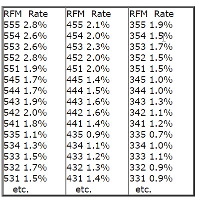
Q: Since our last conversation few months ago, we went ahead and tested 3 different promotions using the RFM model.
The 1st promotion was the test for RFM method itself to see what patterns emerge for response rate, incremental sales, etc. The next 2 promotions targeted the customers from RFM cells with the highest incremental lift from the 1st test promotion. Here is what we saw. Since the targeted audience were our loyalty card members, they transact and spend at a fairly high level (the data below is modified but the trend is maintained). For the response rate, we saw a sawtooth pattern:
(Jim’s note: RFM is the 3 digit score, Rate is Response Rate. More on RFM here and here.)
A: Yes…
Q: As you can see, the response rates decline fairly uniformly from 555 to 511, then rise for 455 and decline uniformly to 411, rise again for 355, and so on. That’s what I implied by a sawtooth pattern. Is the above pattern fairly normal? Based on this data, can you tell if RFM is the right sequence of variables for us? How do you tell if only 2 variables (RF or FM, e.g.) are predictive and throwing in the 3rd variable messes things up?
A: Well, first let me say, if you are testing a sub-group of the population – loyalty card members – then you may see these kinds of shifts. Loyalty card holders especially are a unique group, often driven by Frequency as a result of incentives given. Hard to tell without looking at the program, but it’s possible the program is modifying expected behavior. After all, that’s what you do a properly constructed loyalty program for – to modify behavior! So in your data you might be seeing the footprints of your program at work.
I wouldn’t say the data is “messed up”, it just follows a slightly different pattern, caused either by the population selection, the loyalty program, or some combination. As long as this pattern is consistent though, you can still identify and target profitable segments.
If you would rather see a consistent “parabolic” type response curve, try sorting / scoring the Frequency quintiles *within* each Recency quintile, rather than across the entire population (if you did it this way). This will effectively boost the importance of Frequency in the score and have a smoothing effect. If you really want to go all out, then also sort Monetary *within* each Frequency quintile rather than across the entire population. This “sorting within quintiles” approach is a ton of work manually but is in effect the way professional RFM software does it.
The bottom line though is in the ability of RFM to segment customers into groups which behave predictably so that you can maximize profit. The numerical score is not really an issue; it’s how people with a certain score behave. But if you have a preference as to the way the scores fall, that’s fine too!
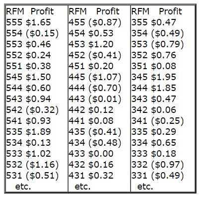
Q: Besides these questions, where we really got tripped up was in looking at the incremental lift per customer (sales per targeted customer minus sales per control customer; the test and control group were well matched and went through statistical rigor to ensure that there weren’t inherent differences in them). Here is what we saw:
(Jim’s note: RFM is the 3 digit score, Profit is the profit per customer for that score)
A: Yes…beautiful thing, isn’t it? Always amazes me to see this data…
Q: As you can see, the incremental lift is all over the place. Some of the lower RFM cells show up higher in lift while some of the higher ranking RFM cells (e.g., 554, 542, 532, etc.) show negative lift! While I am showing the numbers from one mailing, the results are fairly consistent in the other mailing in that some of the mid- and low-ranking RFM cells show the highest incremental lift whereas many of the high-ranking RFM cells show negative lift. How do you interpret this data? What do we change? Any advice you can provide would be very valuable.
A: I can see you don’t see the “beauty” in this data…yet! Why do “mid- and low-ranking RFM cells show the highest incremental lift whereas many of the high-ranking RFM cells show negative lift?”
The short answer is that RFM is a response model, not a profit model (though it can be used to construct a profit model, as you have seen). What you are seeing is normal; response does not always equal profit.
You have just proven this idea with your data but it continues to elude most marketers. The problem with sending promotions to people who are already highly likely to respond (have high RFM scores) is many would have *bought anyway without the promotion*. And the profits from low scores? Direct evidence your promotions are retaining customers and making money. This is a good thing, yes?
Did you read Chapter 29, Expense and Revenue You Might Not be Capturing: Subsidy Costs and Halo Effects? It’s late in the book and I have found over the years many people get excited about the implementation and perhaps skip some of the later chapters…
Anyway, your “higher ranking RFM cells show negative lift” is proof positive that subsidy costs exist, and are why it often is a bad idea to do some kinds of promotions to best customers. You literally decrease their value with each promotion, because the subsidy loss is money they *would have spent anyway* without the promotion.
It is quite common with these high-scoring groups, for example, to see a loss of about $4 with a $5 discount. That means, on average, 80% of the people with that score would have made the purchase anyway without being sent a $5 off promotion. You get some lift but it’s not enough to cover the cost of the total discount dollars given.
Another way to look at it is like this: say you have a customer segment that spends on average $100 a month. You send them a $10 off coupon and that month they spend $100 again – minus the $10 off coupon. So you net $90 in spend and end up with less profits. You left $10 on the table.
On the flip side, when you see lower scoring segments making a ton of money, that is cold, hard as steel evidence that your retention program is working. Literally, this data represents money that was previously left on the table because controls did not spend it and the test group did.
Look at this, the top 10 most profitable scores in the numbers you sent:
Score … Profit
345 … $1.95
535 … $1.89
344 … $1.85
523 … $1.72
555 … $1.65
545 … $1.50
225 … $1.42
453 … $1.20
135 … $1.20
425 … $1.05
4 of the top 10 money-making segments basically contain defecting customers – RFM scores below 350. If the top profit driver 345 segment contains 10,000 customers, you grabbed close to $20,000 in sales from this segment that you never would have seen if you didn’t do the promotion. Look at that 135 segment. These are former best customers, big spenders who have not been active at all for a long time – looks like you have “wakened the dead”, so to speak. If that’s not making money with a retention program I don’t know what is! It’s a beautiful thing.
Here are the 10 lowest incremental sales (highest subsidy cost) generators in the data:
Score … Profit
512 … ($0.70)
444 … ($0.70)
234 … ($0.73)
353 … ($0.79)
455 … ($0.87)
332 … ($0.97)
155 … ($1.02)
445 … ($1.07)
315 … ($1.12)
532 … ($1.16)
So, why do some high scores generate profits and others losses? Why do some low scores generate profits and others losses?
We’ve discussed some of the potential reasons above. But this question really is unimportant. What is important is knowing you can generate $1.95 in sales per customer doing a certain promotion to 345’s. And that you lose $1.16 in sales doing the same promotion to 532’s.
Don’t over-think the results, they simply are what they are. Over time, based on a deep understanding of your business, testing different promotions, and watching the consistent (by score) patterns of profitability provided by the RFM scoring, you will build a theory as to why people in certain scores behave as they do.
Here’s a tip to decrease losses if you must send discounts to high RFM scores tending to create high subsidy costs: try “thresholding” the discount at the average ticket.
In other words, if the average transaction of 532’s is $50 a month, then send a “$5 off purchase over $50” discount. Better yet, customize the offer to the average transaction of each customer for the past 60 days or so.
By using the actual response and profitability behavior of your customers to target offers, you will learn over time what types of promotions drive the highest profits for each RFM score. Once you crack that code, you are on your way to driving serious profits!
Jim
Get the book at Booklocker.com
Find Out Specifically What is in the Book
Learn Customer Marketing Concepts and Metrics (site article list)
Download the first 9 chapters of the Drilling Down book: PDF